Disclosure Scotland
Apply for a basic disclsoure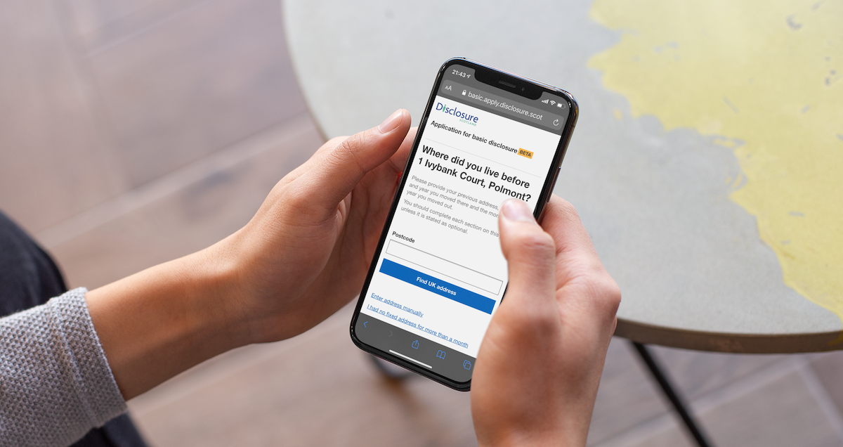
Background
I worked at Disclosure Scotland for 22 Months and was the Lead UX designer across multiple parts of their transformation project to replace legacy case management systems and paper applications.
The part of the project detailed in this case study was to redesign the Apply for a basic disclosure form.
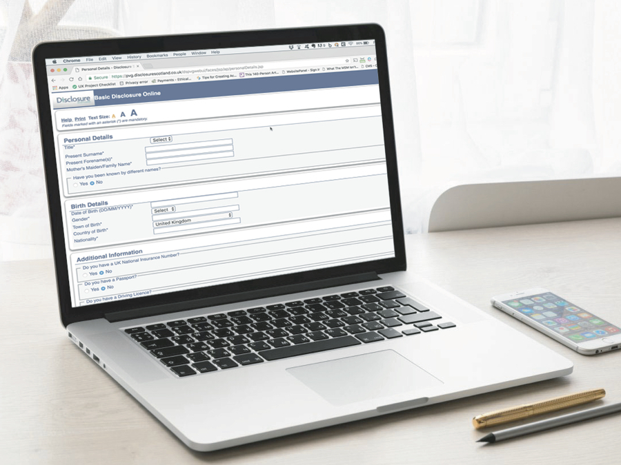
At the time, Police Act Disclosures, or Basic Disclosures could be applied for using a paper form, or an out of date online form which was part of the legacy IT system which was being replaced. Both were confusing, and the online version was not accessible.
The team
I worked in a team with User Researchers, a Content Designer and a Product Owner researching user needs, improving content, defining requirements and designing and iterating a prototype of the service. We also worked closely with Policy and a team of subject matter experts from the organisation to make sure that our new service met all business, legal and policy requirements.
Pain points and user needs
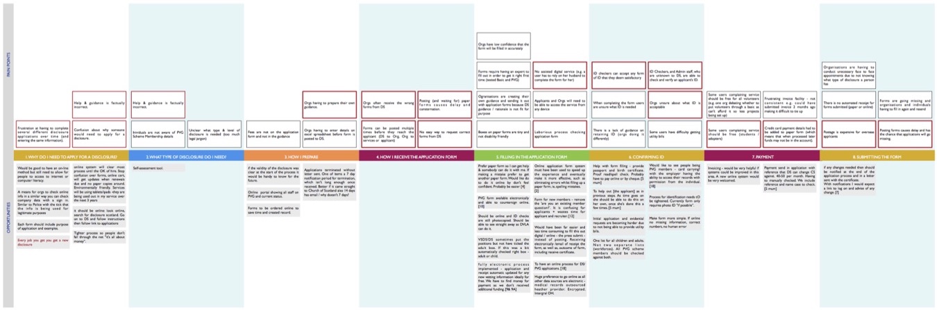
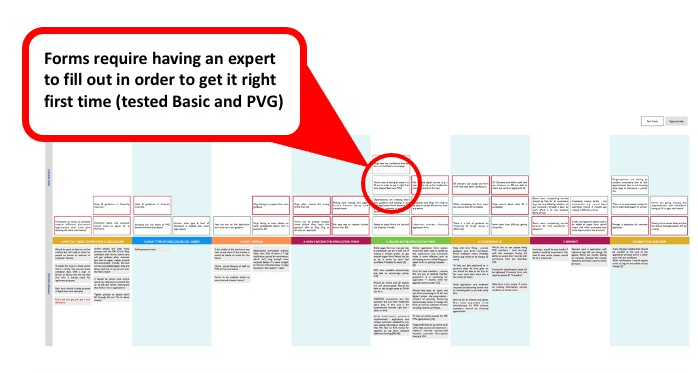

The existing paper form was used for applications for three different disclosure types. This led to many incorrect applications being submitted, which had to be completed again and reprocessed. A waste of money for those who applied, and a waste of time for staff and applicants, who were often waiting for these certificates to start a new job.
Both paper and online applications asked unnecessary questions, and did not explain the need for certain information, both potential GDPR issues.
The guidance around the form was so confusing that it led to organisations like Volunteer Scotland publishing their own guidance on how to fill out the form.
https://www.youtube.com/watch?v=tSFwTuF-o3Y
Process
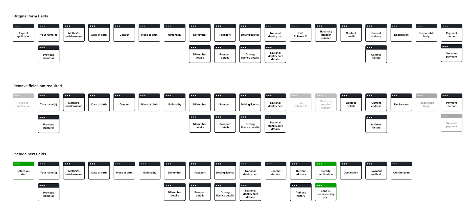
I worked with the User Researchers and Content Designers to identify the fields that we felt were no longer necessary, or needed to be improved, and we mapped out an iteration of the journey flow, marking up which parts of the journey were simple and which were complex.
We then started to work through that flow creating a prototype with a library made from the Scottish Government Design System.
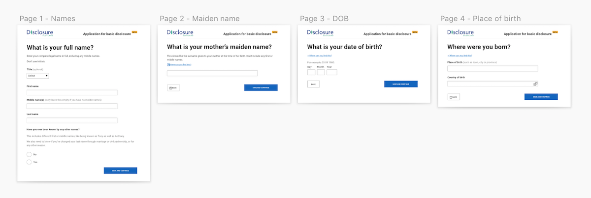
I quickly moved from sketch into an HTML prototype, maintaining the flow diagram and Sketch file as the agreed flow, design and content, with the html for testing purposes only. It’s important when doing this type of usability testing to get as close to realistic interactions as possible, so using Sketch as a prototype would not provide the right kind of insight.
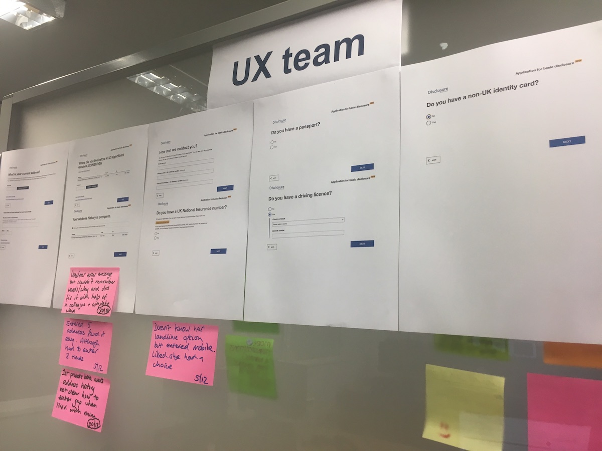
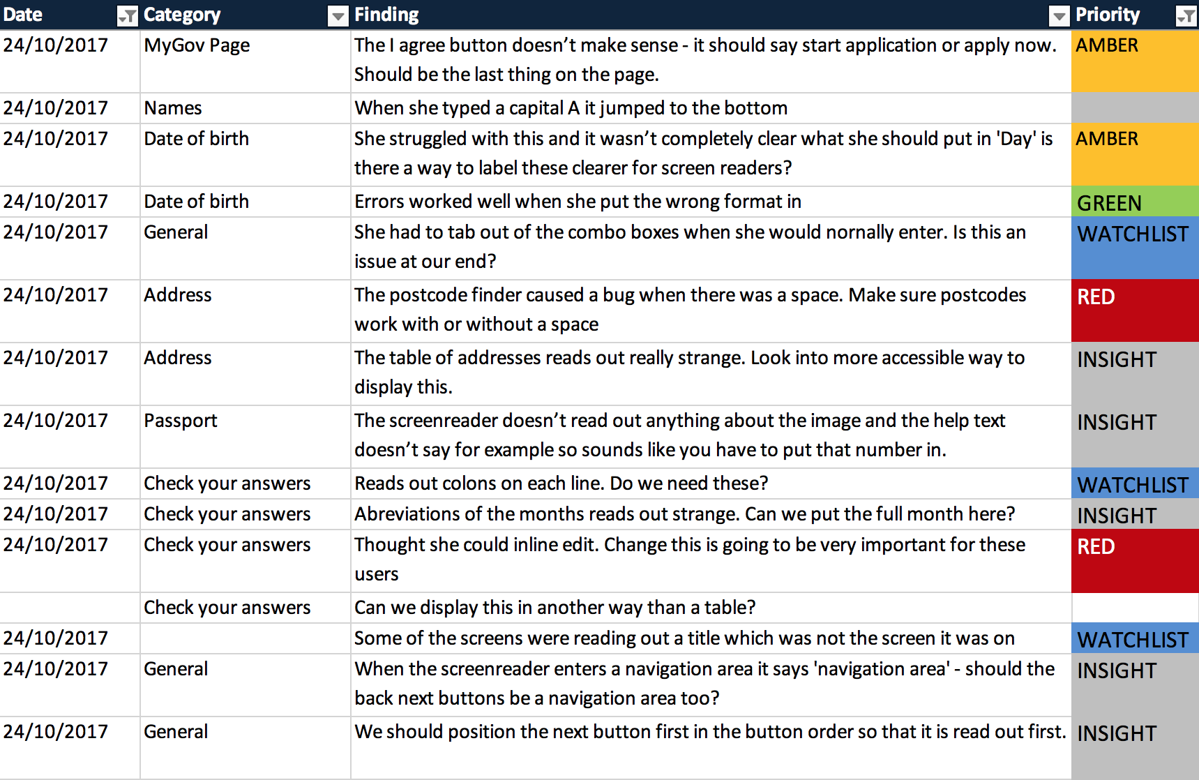
We worked in two week sprints, designing, researching and iterating. This allowed us to test some of the more complex interactions, iterate them and test again. Starting off with a section of the application, until we had a full flow to test the end-to-end journey, including the un-happy paths. With the Content Designer, I observed the research, alongside other stakeholders. When we had production code available we did several rounds of accessibility testing with users who use assistive technology.
Key interaction problems
Capturing five years of address history
This was a key issue with the original forms. Applicants needed to provide up to five years addresses in a seamless way, without any gaps. The problems with the original forms were that people often did not provide their address history going back far enough, or they missed out addresses, leaving gaps. Some people also struggled to calculate back 5 years.
I sketched out various ideas for this. Allowing people to add another address to the table. But we needed validation to stop them leaving gaps.
I came up with an idea to move the address and address history parts of the form together and to add a field to the current address asking ‘When did you move into this address?’ This would completely remove the need to show anything about address history to people who had lived in their address for more than 5 years. We would then ask ‘What was your previous address?’, getting them to enter this, along with the date that they moved into it. Working back until we had five years of address history with no gaps.

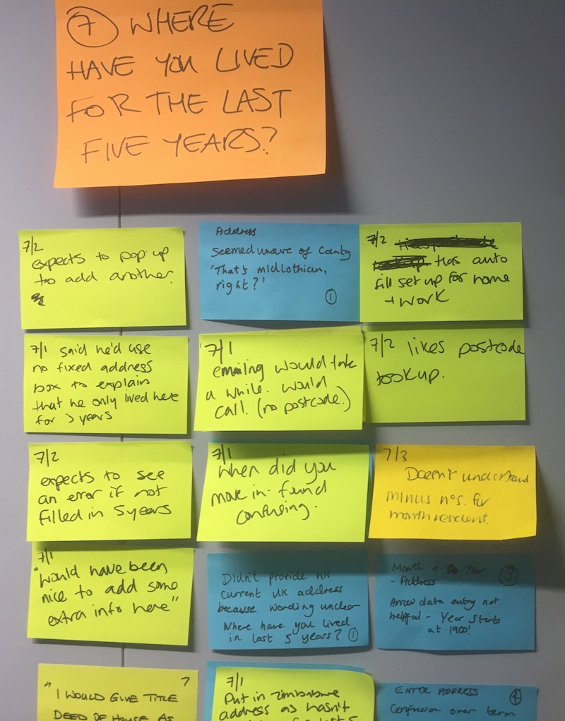
Over a series of usability testing sessions, we refined this idea to improve usability and accessibility. We added an introduction screen to warn people that they were about to be asked where they have lived in the last 5 years, automatically calculating the date based on today’s date, and providing information for anyone who may have a complex address history. We changed the secondary address questions to ask “Where did you live before [previously entered address]. Populating the question with their own address prompts their memory better than using dates.
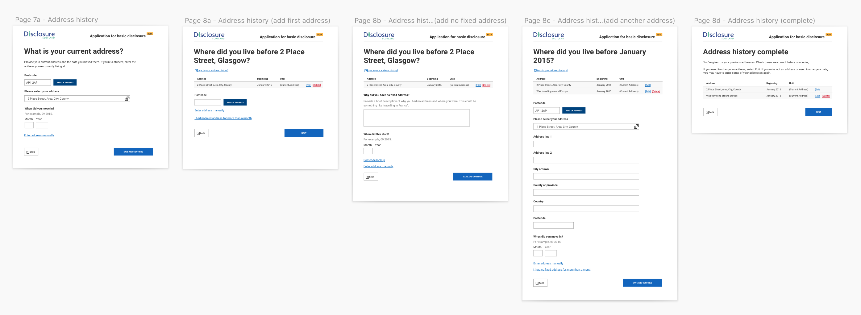
This piece of the flow was called out as an exceptional piece of user centred design in the Digital First Assessment – something that I am really proud of.
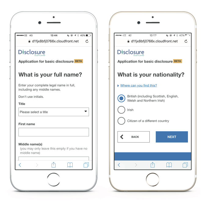
Long select menu for nationality
This was an interesting interaction problem and an example of where we tried something new and then went back to an iteration of the original design.
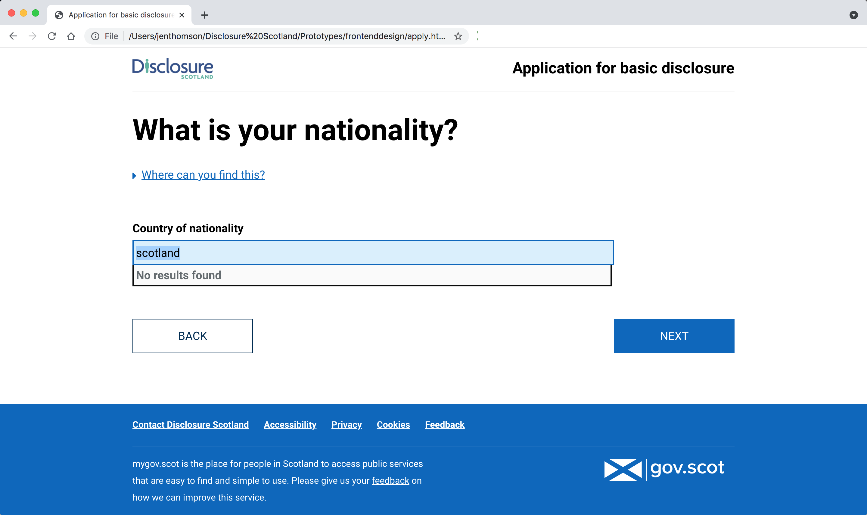
Our original design used a long alphabetical list of countries for nationality. In research, we found that a lot of people were looking for Scotland and were frustrated when they couldnt find it on the list.
I had seen an accessible autocomplete component created, which also mapped translations to a single entity. For example, if someone typed España, it would turn it into Spain. We decided to try that, changing Scotland, England, Northern Ireland and Wales into the United Kingdom.
This did not test well with users. People’s reactions ranged from confusion “I didn’t type that”, to anger “I don’t consider myself British, I’m Scottish.” and it stopped a lot of people in their tracks as they questioned why it would change like that. What seemed like a good idea was a hindrance to users.
As most of our applicants were from the UK or Ireland, we changed the options on the Nationality screen to:
- British (including Scottish, English, Welsh and Northern Irish)
- Irish
- Citizen of a different country
This made a massive difference as when people are prompted, they will select the closest option, rather than looking for what that they most align with.
Using the autocomplete to make long select menus easier, applicants couldn't find the country they identified with.
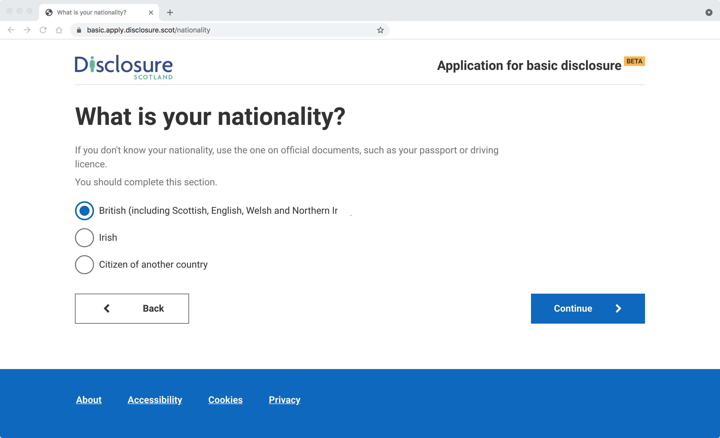
After trying mapping Scotland to the UK, which did not work, I changed this to providing the most common options as radios, with a conditional-reveal for other countries.
This completely resolved the issue, as people are much more likely to choose from clearly provided options.
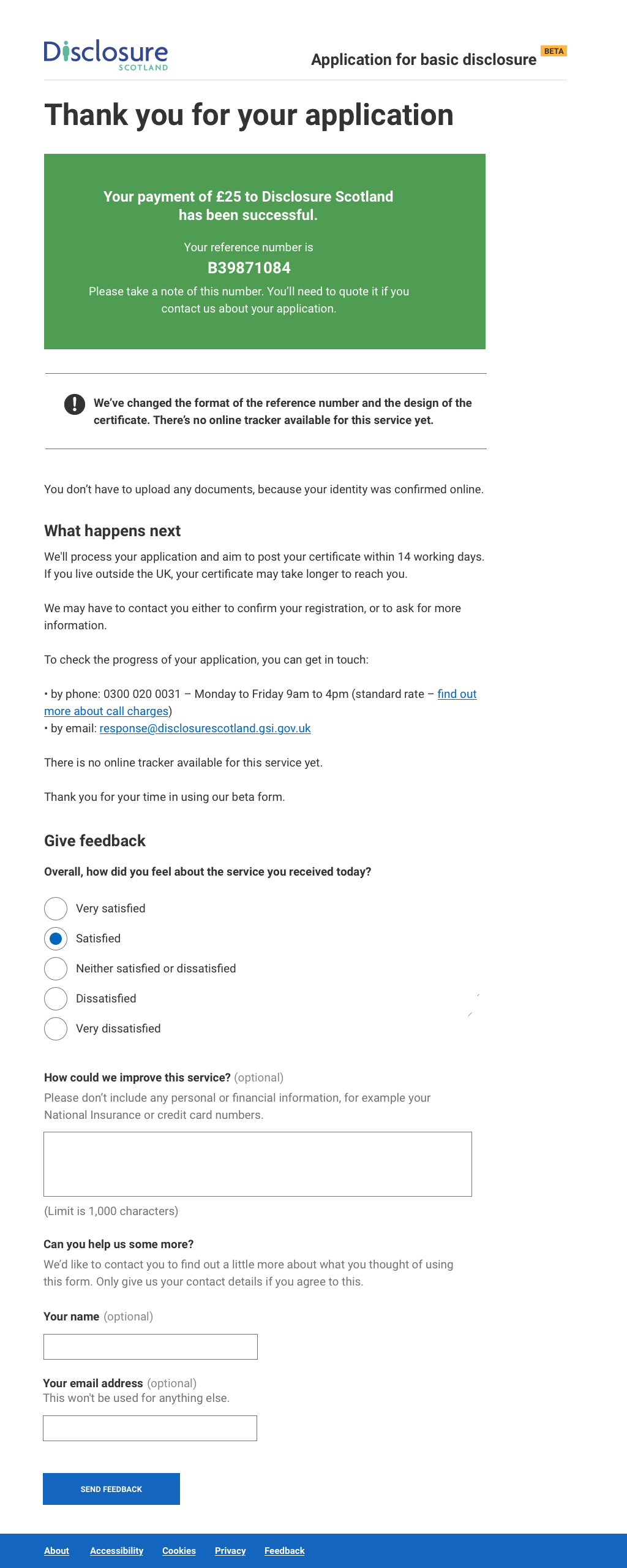
Capturing user feedback about the service
Once we were in private beta, we wanted to capture ongoing user feedback about the experience to see how people found it, and also capture any improvements that were suggested. The problem was that after an applicant had completed the form, they were not clicking on the feedback link. Adding fields to the existing form was initially rejected because we would have no way of collating the feedback, and embedding a Survey Monkey or other module wasn’t accessible.
I came up with a plan to try embedding a Google Form code into the confirmation page which could use the applications stylesheets instead of the default ones, and when submitted would add the results to a google sheet. This let us capture satisfaction and ease of use scores, and also feedback in one place, with relatively low development costs.
Accessibility testing
The result
The Apply for a basic disclosure service passed it’s Digital First assessment with flying colours and was used as an exemplar for user centred design and assessment documentation by the Scottish Government.