Snaggin’
A quality assurance app for home buyers to log snags with their new home build.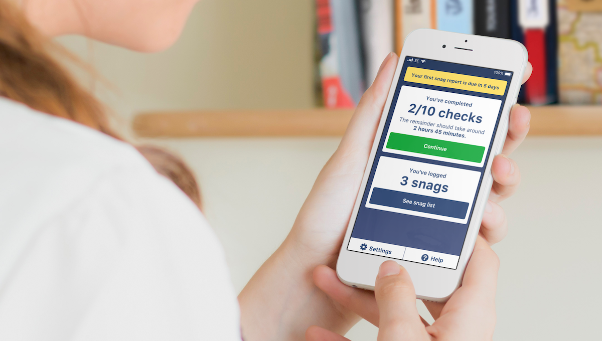
Background
Snaggin’ are a startup in the housebuilding industry, who want to improve the process of finding and reporting snags – or defects – in new-build homes, and make analysing and tracking the issues easier for the developer.
Buyers typically have 7 days to complete an initial snag list after entry to their new property and another 21 days to submit a final list; these snags will be fixed for free as part of a quality guarantee with their purchase.
The project
This project was to design the interface of a mobile app for a pilot scheme. It would be used by homebuyers to walk them through a thorough check of their new build home and let them easily report defects.
Each user's experience would be tailored to the exact specification of the house that they have purchased, from the number and order of rooms, to the windows, doors and fixings within them and show them what to check for at each item.
The process
User journeys
The user journey for this app would be particularly important to its success. Doing a thorough check of everything in your new home can be a lengthy job and may not be done in one go – so it's key that users could pick up a session where they left off. It’s also important to make sure that users are clear what part of the room they are checking at any given time.
A key issue at this stage was the difference between how professionals would do something vs how my gut instinct said a lay person would tackle it. I mocked up flows for both, putting them to the client, and we would later test these assumptions in some research sessions.
Another consideration was onboarding people smoothly and ensuring that this was as pain-free as possible.
UI ideation
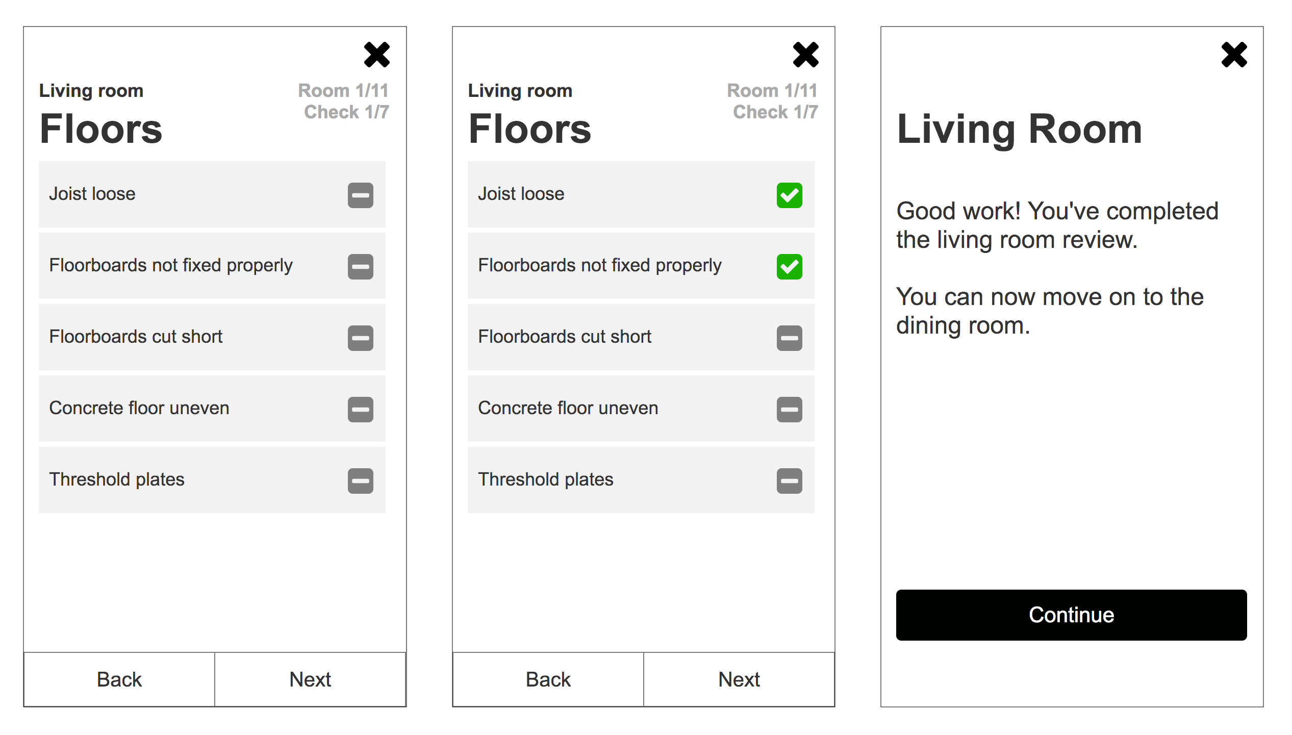
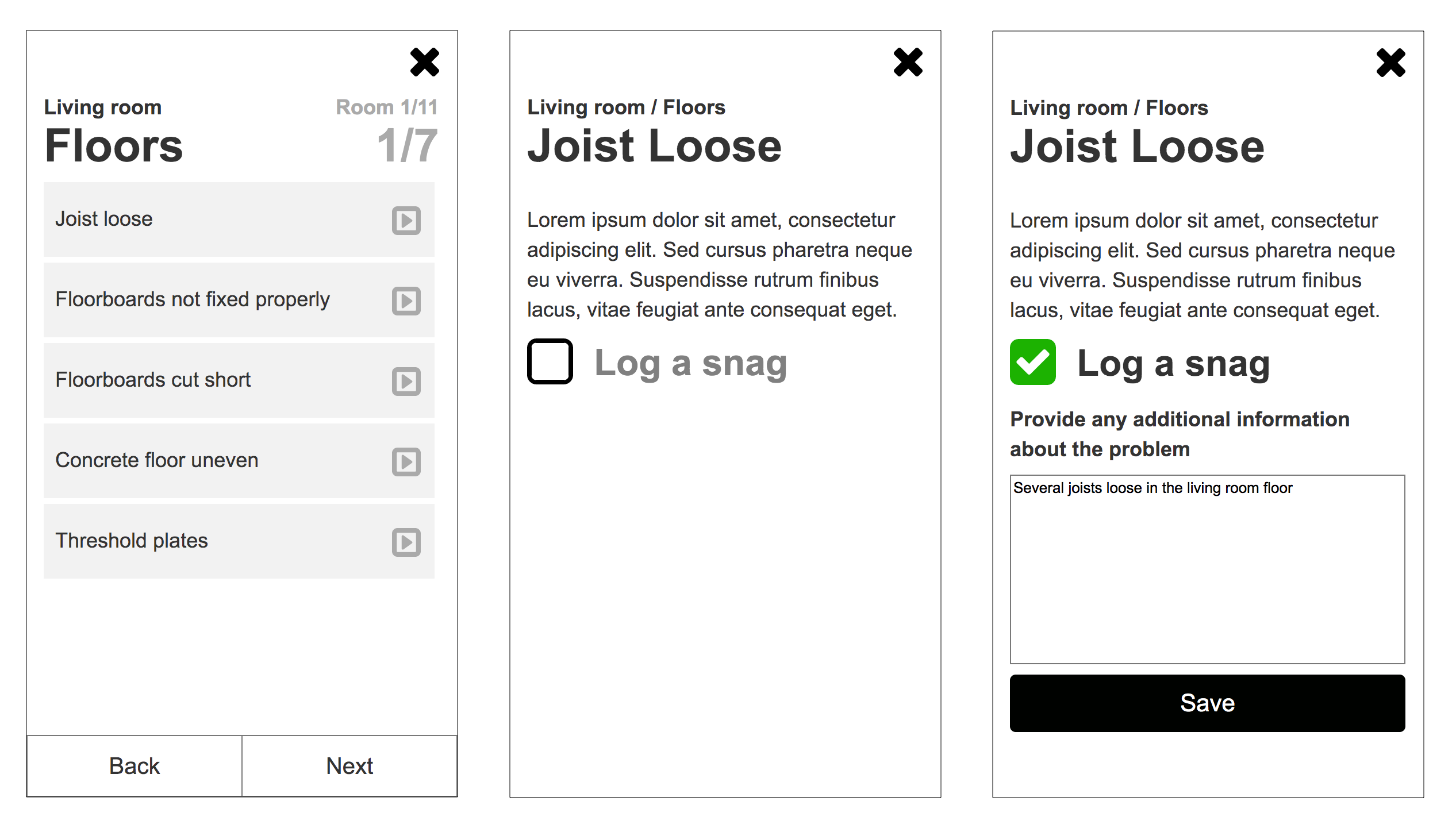
With this type of app, where people will be making repeated actions, possibly over a long period of time, it is important to make it as clear, user friendly and accessible as possible. It had to be clear what room you were checking, what wall, or surface you should be on, and the item you should be looking at.
The interaction of logging a snag should be simple, but also allow a user to provide context.
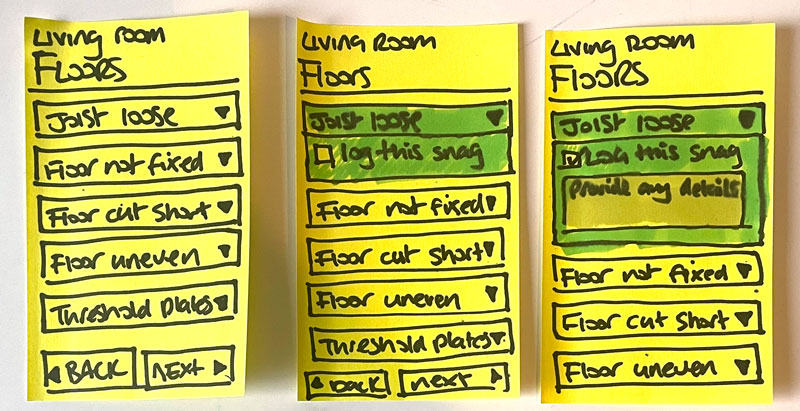
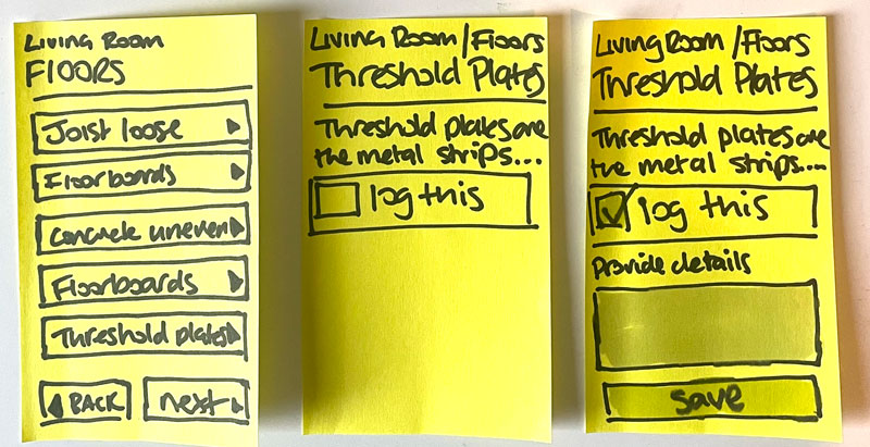
I started out with sketches of ideas and moved into wireframe mockups.
Prototyping interactions and research
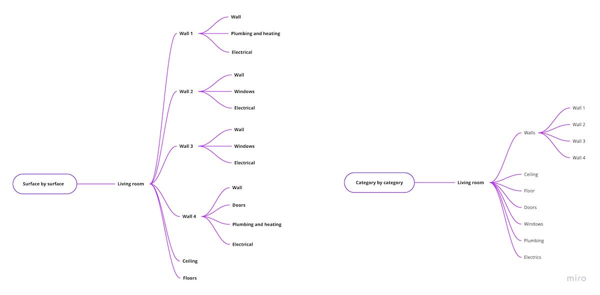
I prototyped some sections of the flow in Axure to test out some key interactions. I wanted to test whether the professional order – one wall at a time – was the right way to do it, or if my gut instinct, that lay people would prefer to complete checks by the category of items, ie; check all the surface then move onto the joinery, the windows, then then electrical items, etc. was easier.
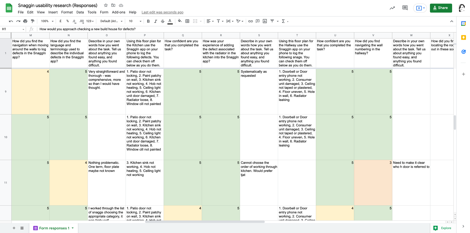
I recruited participants who had recently bought new build homes, and had experience with snag lists to do some research with around the flow and interactions. I asked them up front to provide a sketch of the layout of their living room so that I could customise the flow to show their content. I asked them to follow the flow, logging snags they could see, or ones that had been in their home as examples, and to talk out loud to me as they did it. This gave me insight into how the prototype worked for them, their mental models, and how we could improve the interface.
Content design
The content for the app had been written by stakeholders who were industry experts, which is great because it meant that data we would be collecting would be sound. but lay people often don't know the professional terms. As this was to be used by the public, independently, I had to ensure that everything was clear and easy to understand. This meant renaming things to use plain English wherever possible, explaining what terms meant, using clear signposting to indicate what room, wall and item a user should be looking at and testing these out with the general public through research.
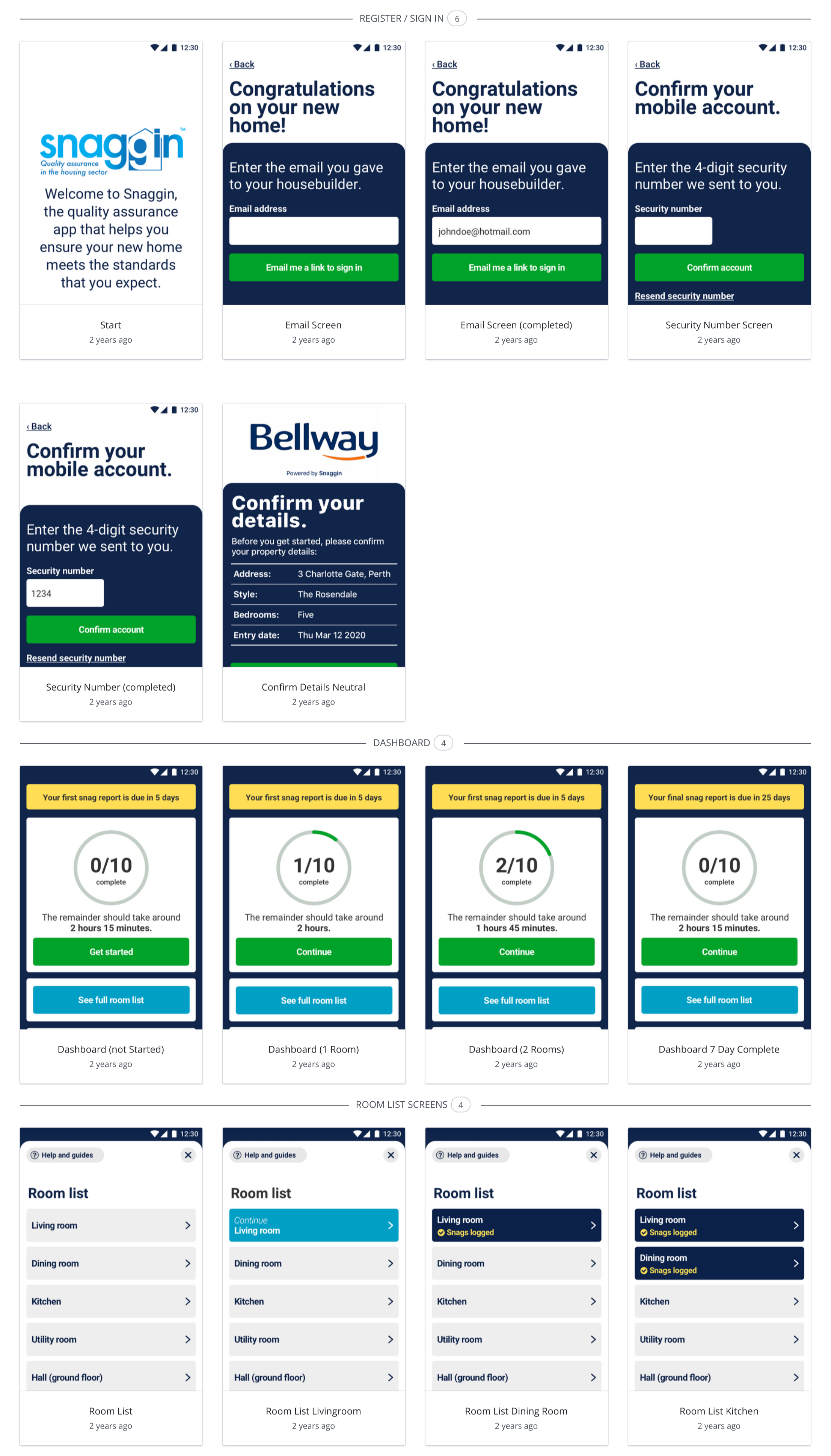
Hi-fidelity design and prototype
Snaggin’ already had a brand design and colour palette which I used with the wireframes to create some high fidelity screen designs. I wanted to make sure that the design for this was as accessible as possible and moved between Sketch and small InVision prototypes to test out interactions.
Further research
We did a final round of research with an InVision prototype which we sent out to a panel of people which included a combination of new and some original participants. Making sure to include people who had no experience of logging snags.
Stakeholder engagement
Good stakeholder engagement is essential in projects like this where you are bringing to life someone’s idea that they have often developed through their own passion and industry expertise.
Industry expertise is often very different to a lay person’s way of looking at things and throughout this project I brought the stakeholders around to seeing things from a lay-person’s point-of-view, validating my ideas through research – either usability testing, interviews, or surveys.