Workflow tool
Office of the Public GuardianThe project
The Office of the Public Guardian is undertaking a transformation project to improve the user experience and the accessibility of their case management systems.
This part of the project is to design a workflow tool to help Workflow Managers track and share tasks within, and between, their teams.
Understanding the current processes
I paired with the User Researcher for a series of interviews with the Workflow Managers so they could talk us through their processes. I also shadowed some of the Workflow Managers while they did their jobs and had them talk me through what they were doing and why they did it that way.
This is what I learned:
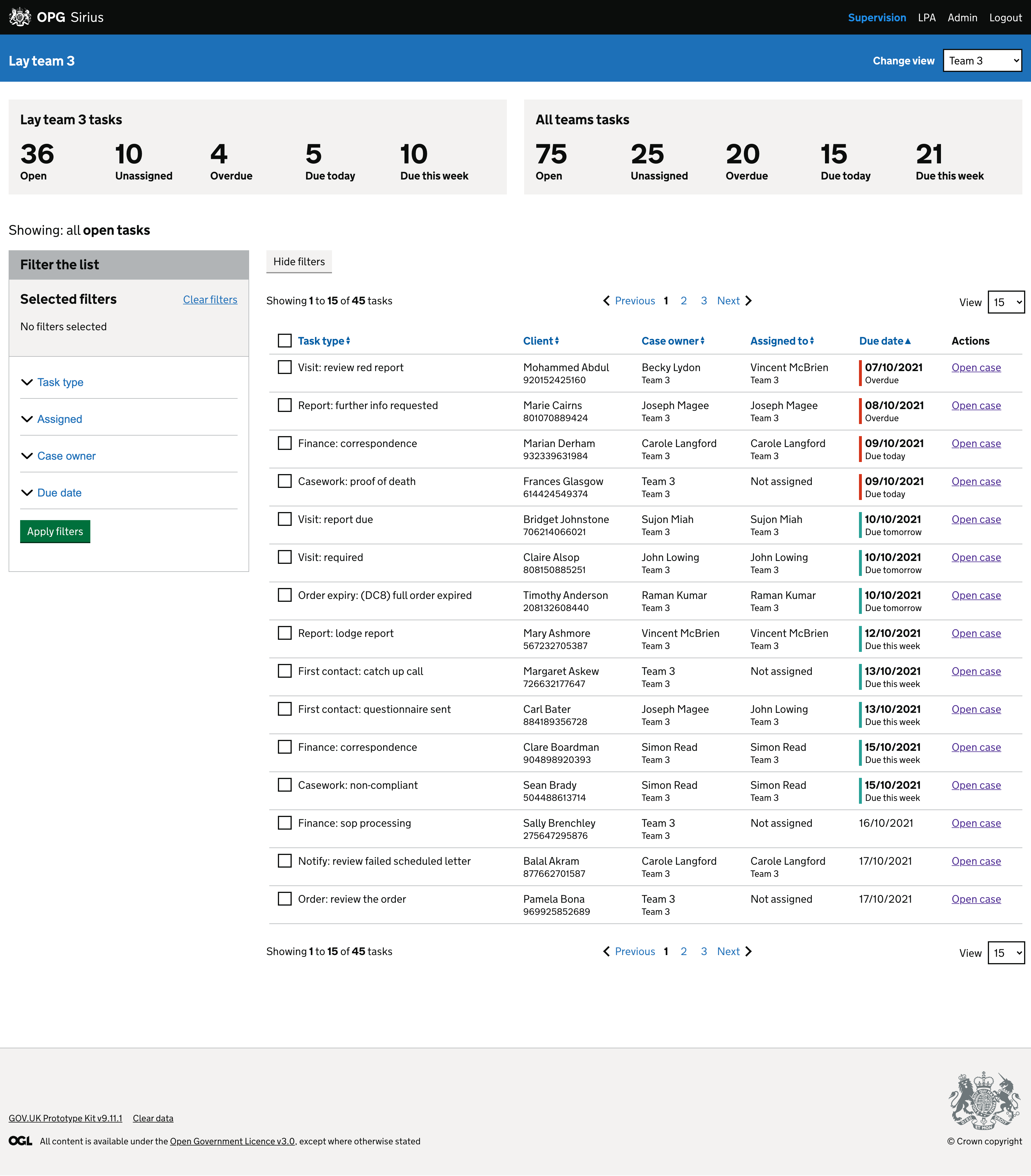
Workflow Managers export data for each team’s workload and a snapshot file is manually updated every week which covers the type of tasks, what has been completed, what is due and the age profile of due tasks and the date of the oldest due - colour coordinated to highlight things that are overdue.
These snapshots help them to see what work needs to be completed in a given week, prioritise overdue and important tasks, and reassign tasks to other Case Managers to balance workloads.
Each workflow manager has a different process to allocate work to their teams because there is no standard process or tool.
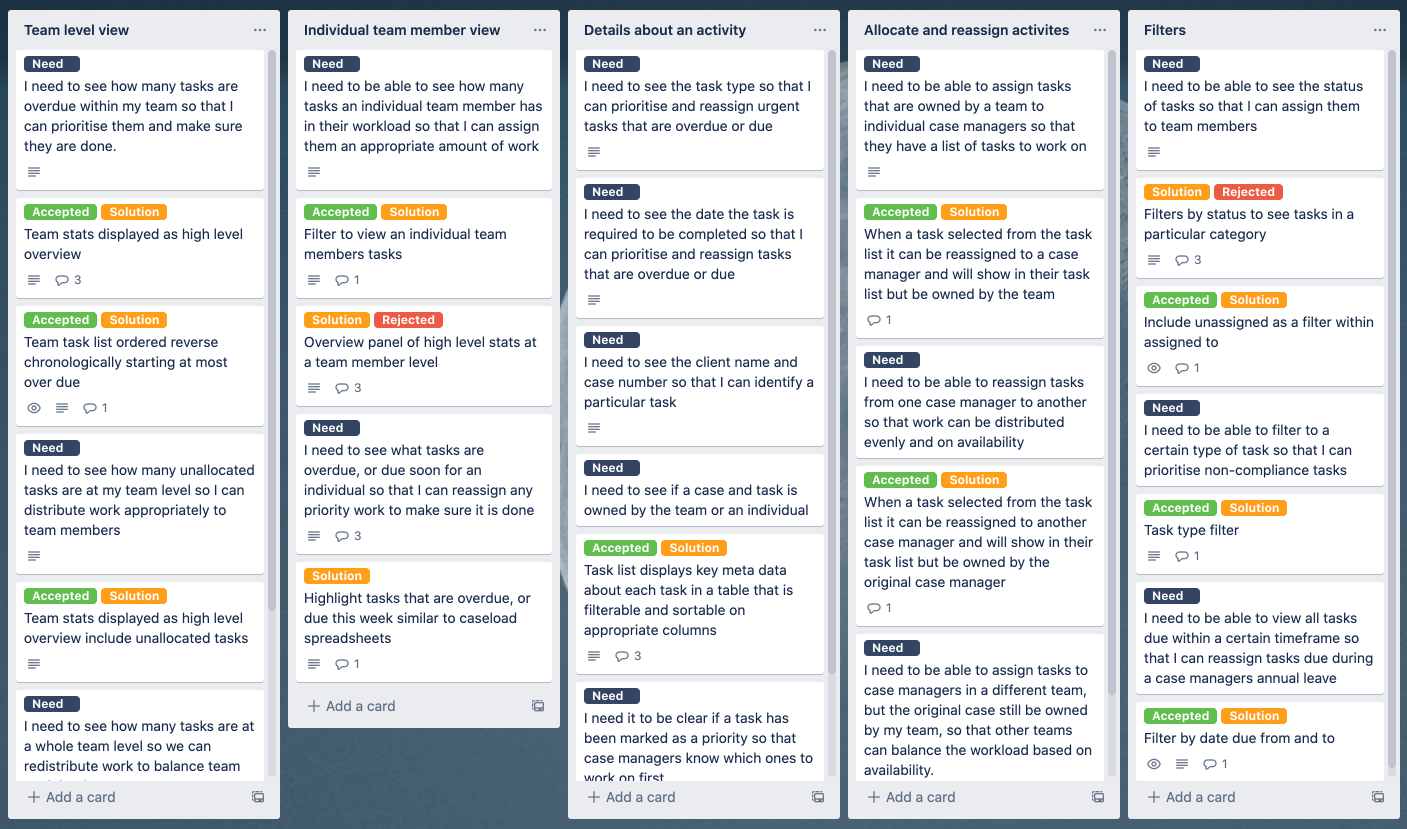
User needs
From these interviews and shadowing sessions we were able to distill the key user needs that would help shape the functionality of the new tool.
Sketching ideas
The initial sketches were exploring the information hierarchy and use of screen space. We would be displaying a large amount of data and it was important to get this across clearly. I also reached out to designers from other Ministry of Justice departments and on the Cross Government Slack to find out how they had solved similar issues.
Mockups in Figma
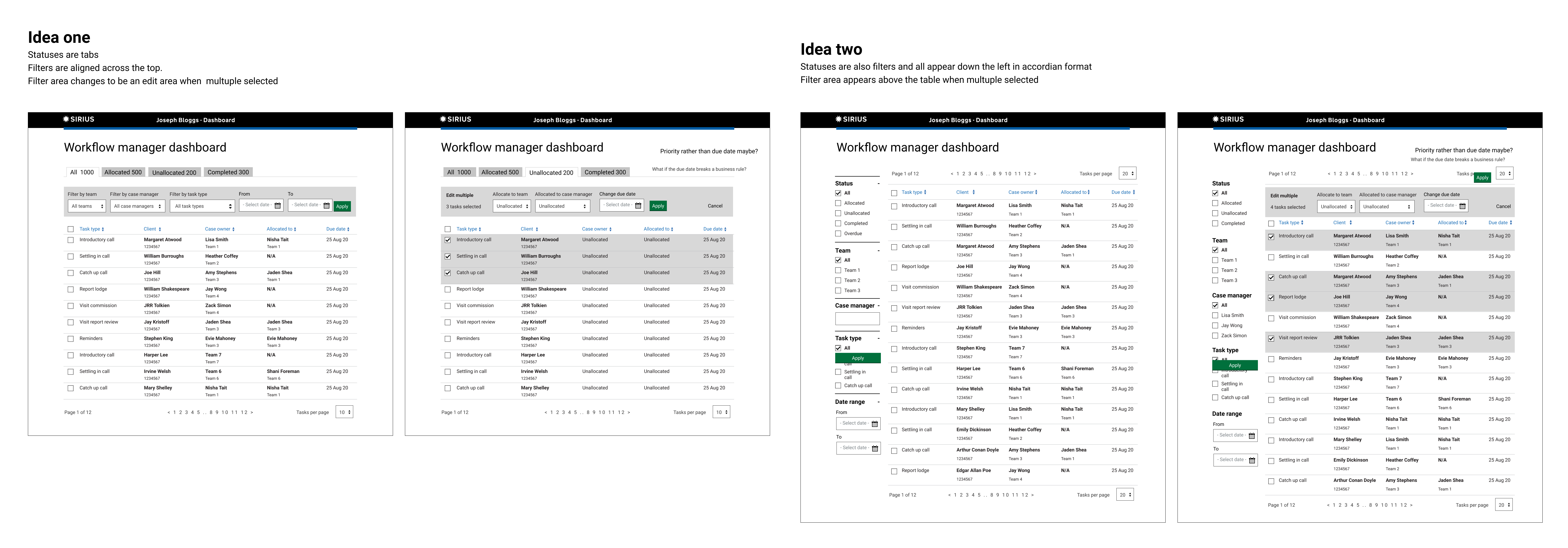
Once I had an idea of the layouts I wanted to try, I moved into Figma using the GovUK design library. This let me very quickly pull together some screens to get a feel for how the structure would work. I was then able to discard Option 1 which, although had been used elsewhere in the Ministry of Justice, wouldn't allow for flexibility of adding on more filters and could be problematic for users that have to zoom in or increase font sizes.
Prototype in Figma
Confident in the decision to move forward with the vertical filters panel I mocked up screens with the key elements we wanted to test with users.
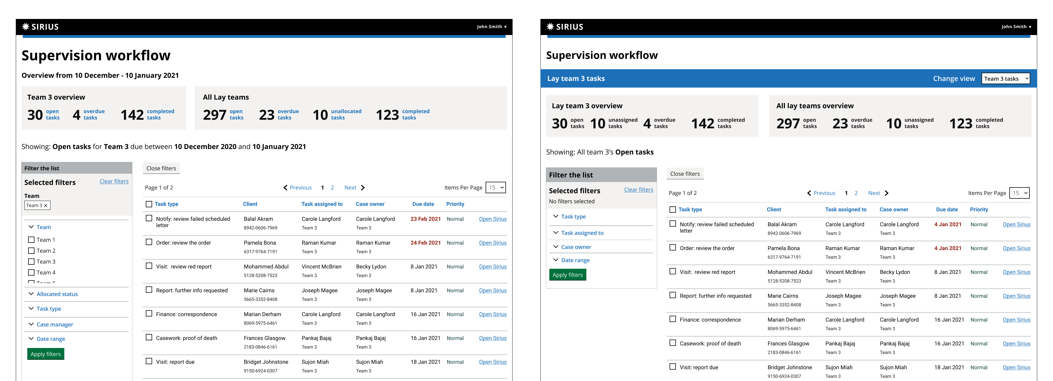
Iteration 1
Data table
It’s important that we have understood the data requirements for this tool, and that it is easy to digest and also to manipulate.
Note: To make this prototype as realistic as possible, I needed some data and to make this simple I created a spreadsheet with fake case data and used the Google Sheet Sync plugin to sync it to my table rows.
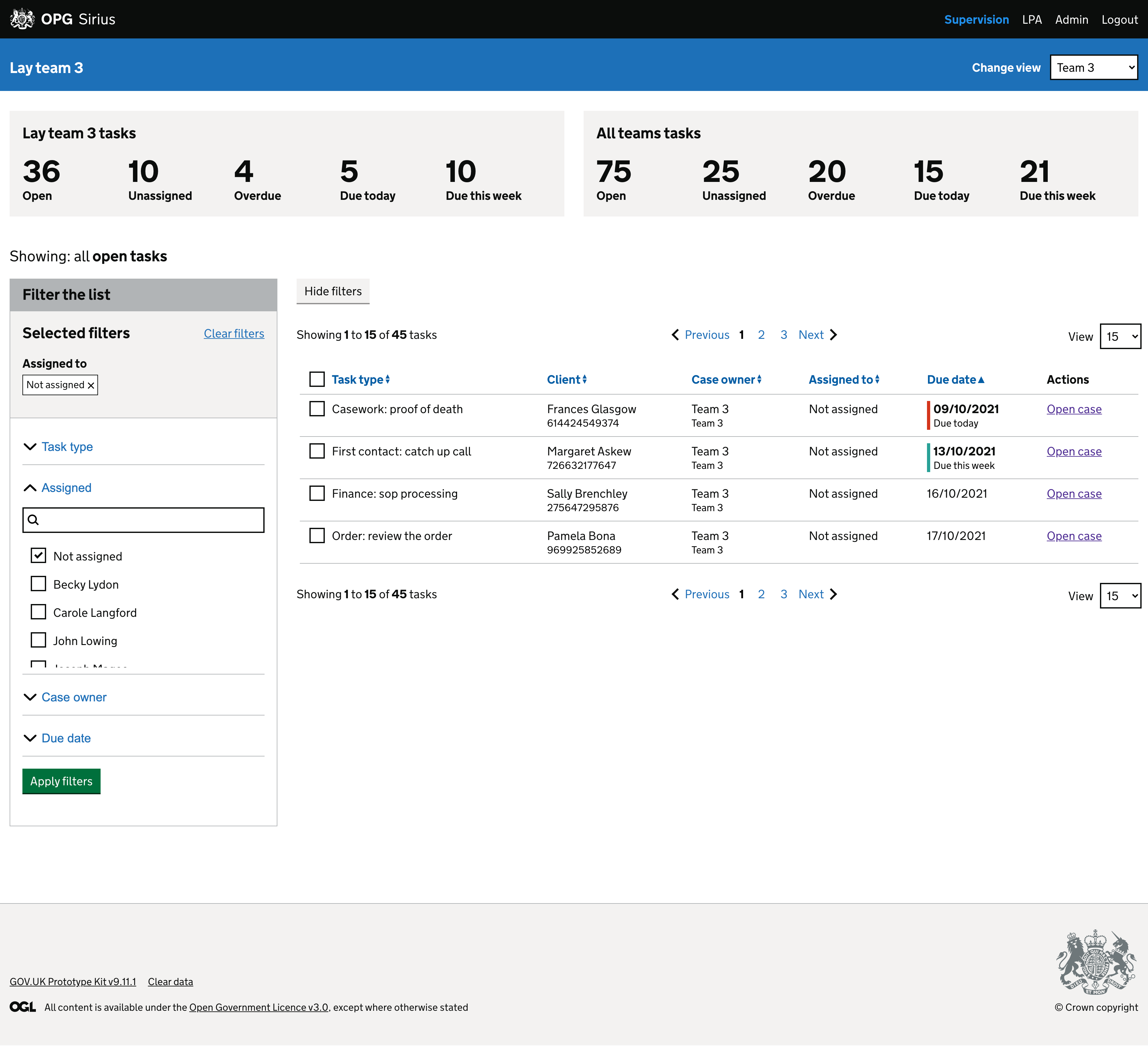
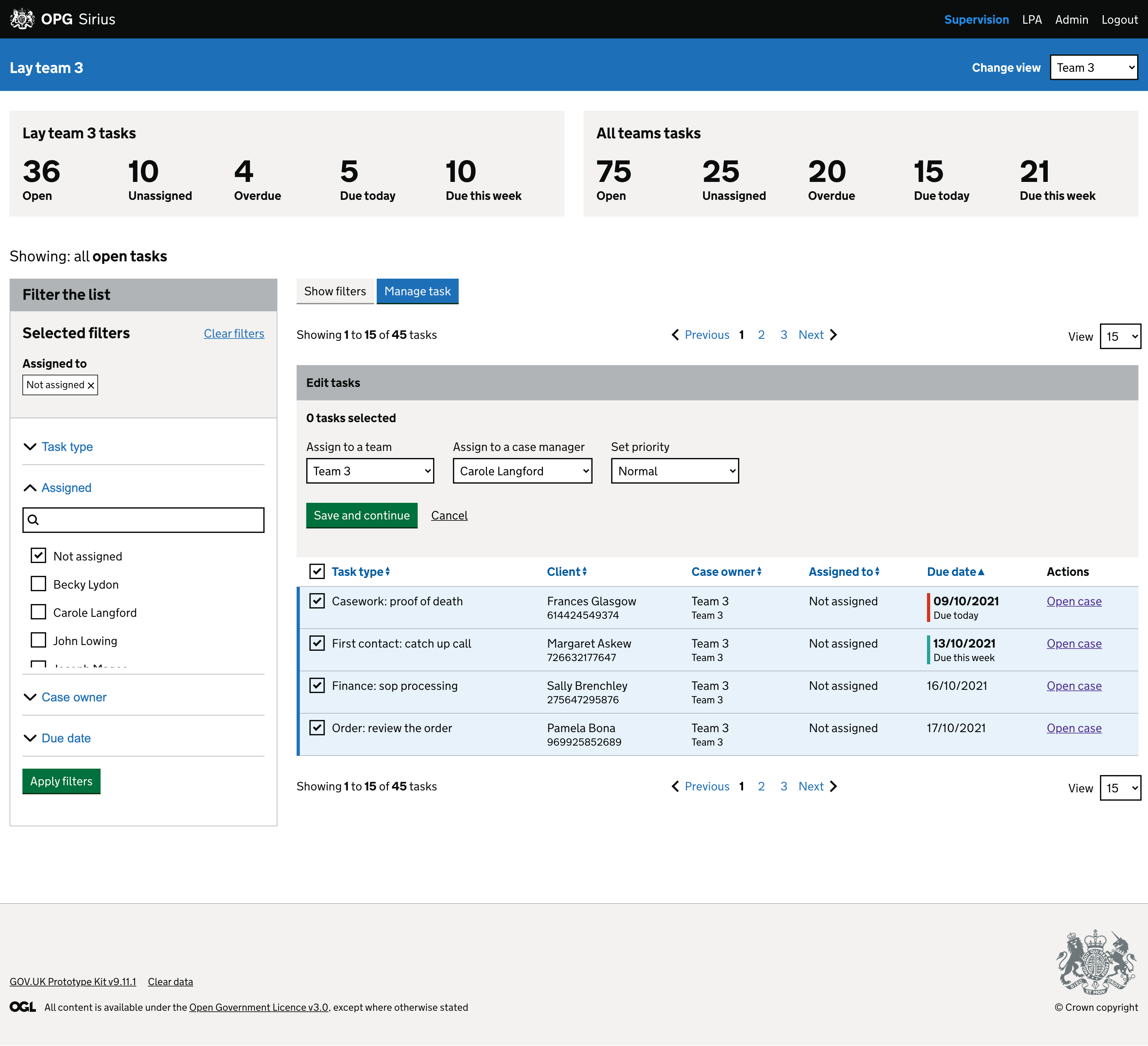
Reassigning tasks
This is the key user need for this tool and has to be simple to do for single or multiple tasks.
Round 1 of usability testing research
Some things we wanted to validate with the Figma prototype:
- Is the information presented in a clear and easy to read way?
- Are we showing all the information that they require?
- Is it clear how you would filter the table results to see tasks of a specific status or for an individual?
- Are the show and hide and accordion elements of the interface intuitive?
- Is it clear how you would reassign a task?
Iteration 2
Department view vs team view
I had designed two variations of the screen, one as a department dashboard with a team as a filter, and one as a team dashboard with a switch to move between different team views. Users had said they wanted to view other teams workload and compare but we needed to understand how important it was to view teams together and compare this with the effect that loading a whole departments worth of tasks might have on the speed
Round 2 of usability testing research
Some things we wanted to validate with the Figma prototype:
- Should the dashboard be for a team, or for the department with team as a filter?
- Is it clear when a case is owned by the team rather than a case owner?
- Is it clear how you would view an individual's tasks?
- Do the filters meet the user needs?
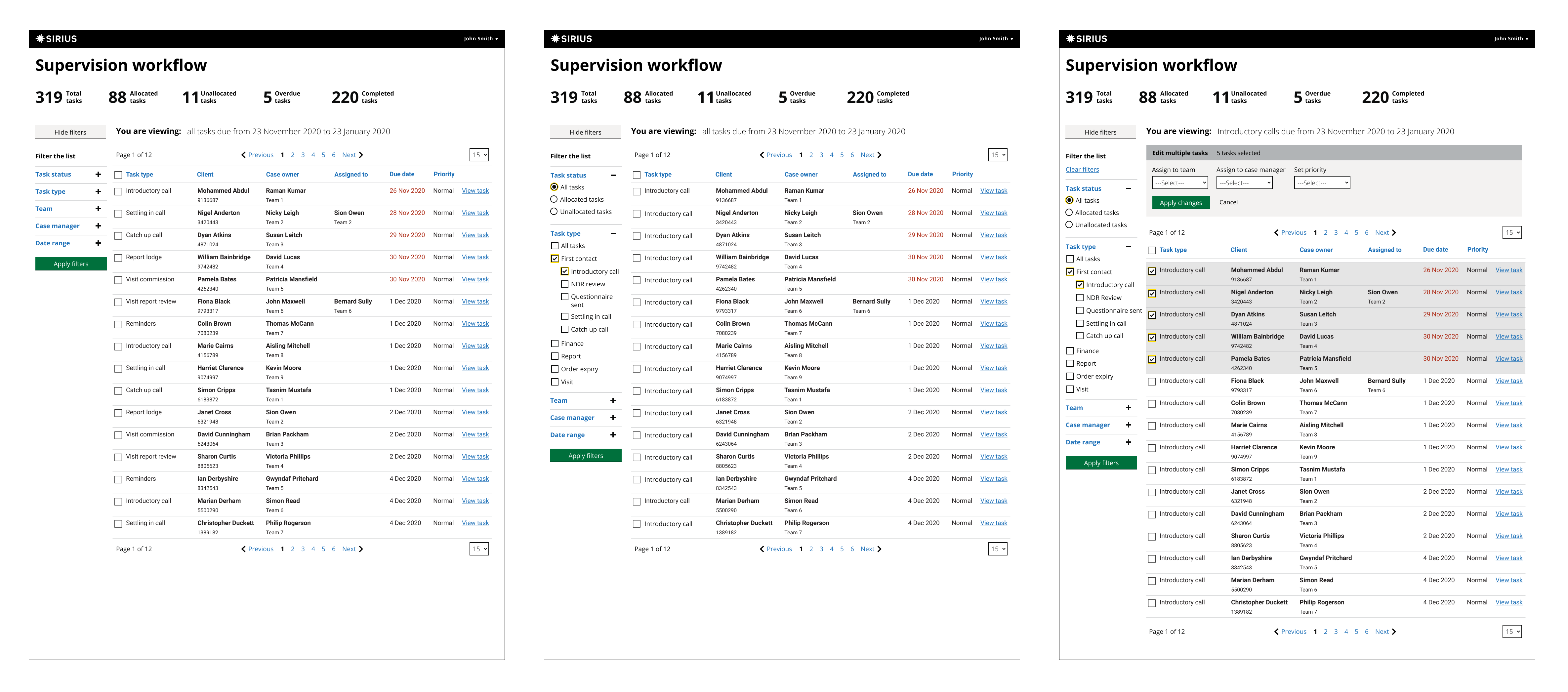
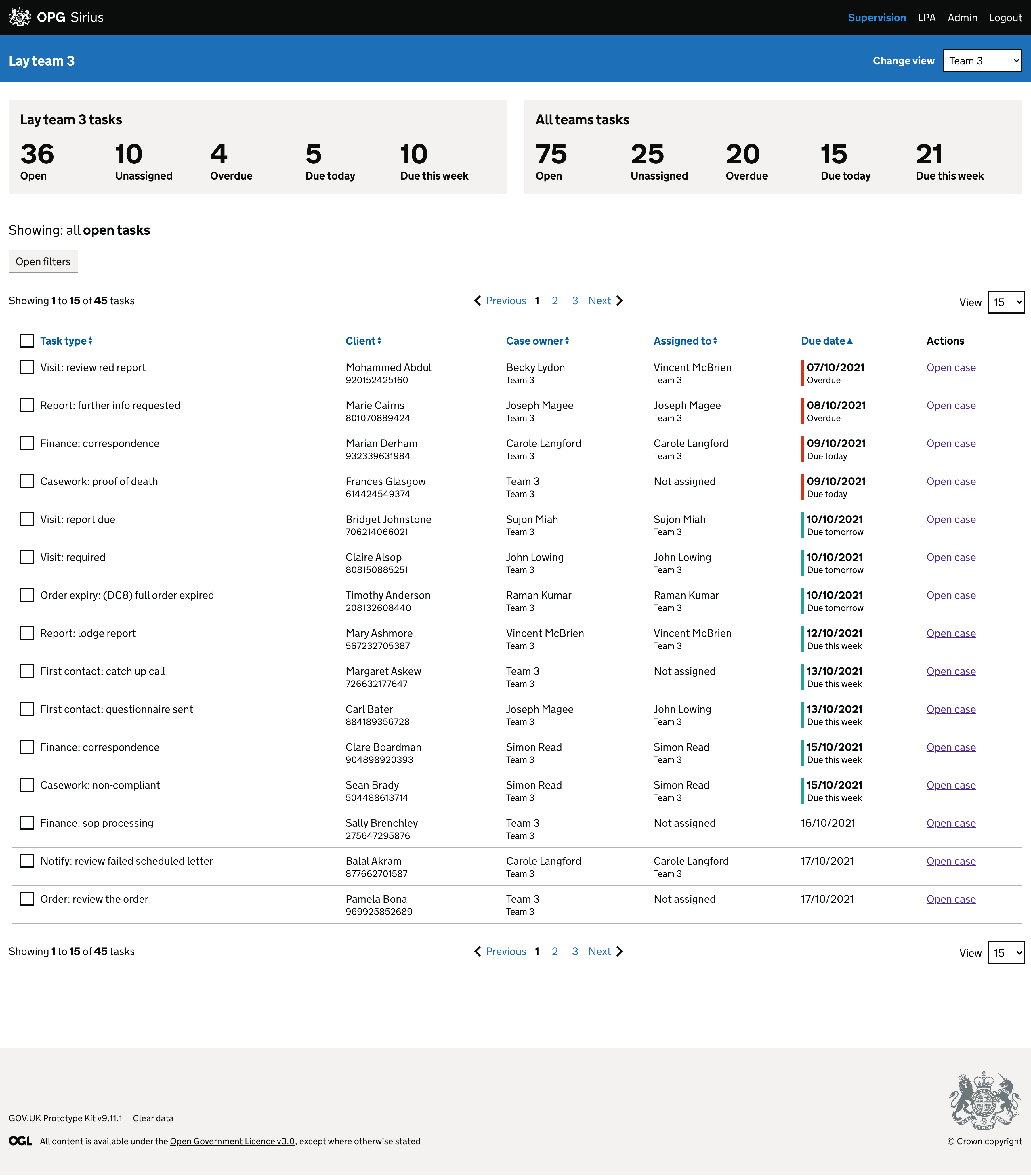
Prototype in Code
After an initial round of user research with the Figma prototype, which confirmed we were on the right track with these designs, I moved into a coded prototype. There are benefits to a coded prototype when you have a complex interface: you can hold states of elements a little easier than in Figma and allow users to play with features; and you can update elements on the fly with Javascript instead of requiring a new screen for every state change.
Coding the prototype would allow us to test the new filters component in more detail, get a better idea of how the design would respond to different screen sizes and also iterate faster.
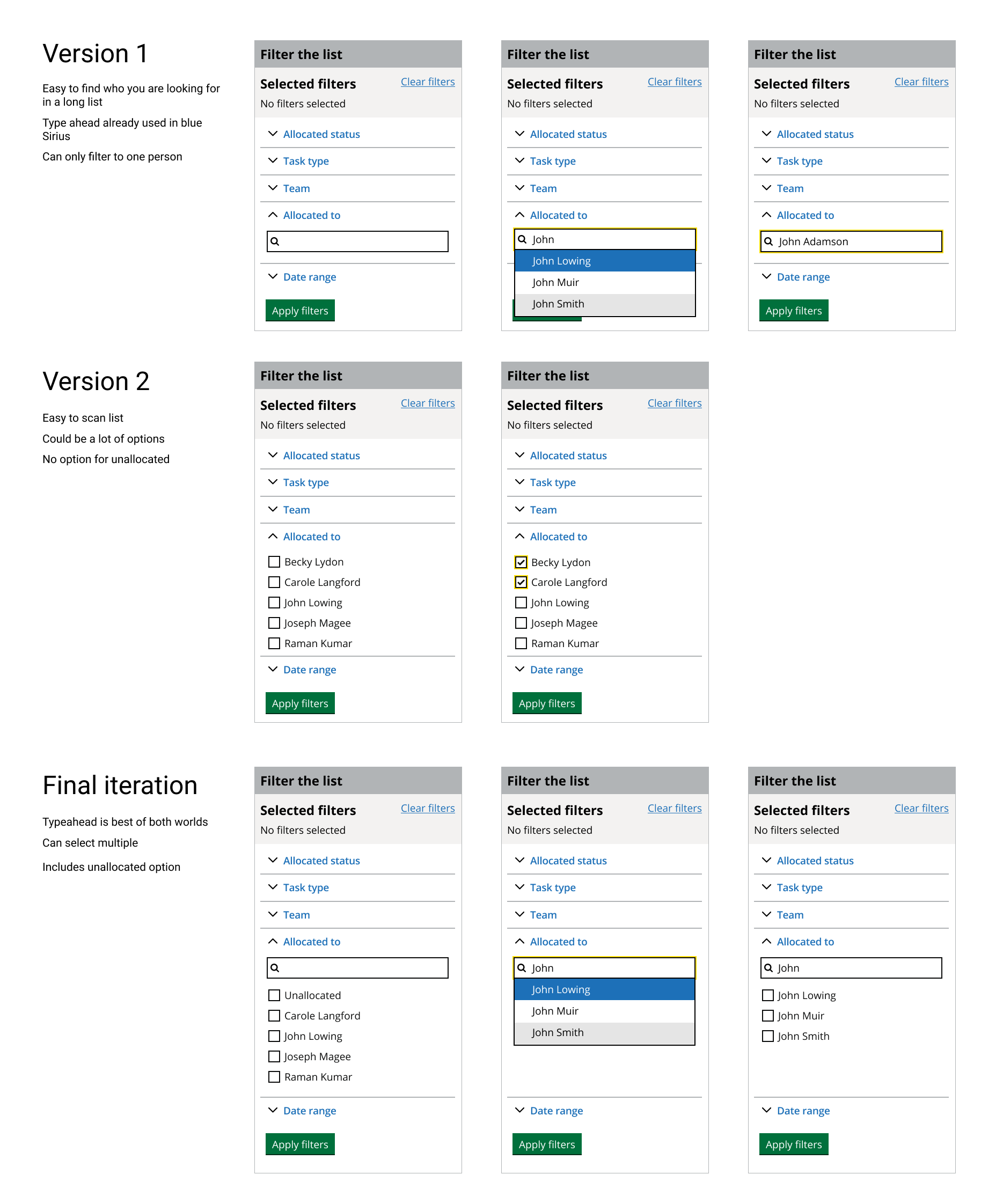
Filters
The filter component within the MoJ Design System that I used initially was going to be too simple for our needs.
- Some of our filters might have a long list of options that are hard to scan
- Because of migration we were unable to reduce or combine these initially
I tried a couple of options, using the accessible autocomplete component to let users search for what they were looking for proved better than looking through a list. But it would be a complex interaction to allow users to select multiple.
I reached out on the Cross Government Slack channel to see if any other designers had solved similar problems. I found the Option Select component and thought that would fit our needs better and allow users to select multiple options, and also find things in a list.
This was successful and is now being developed into the MoJ Pattern Library as an advanced variation of the filters component.
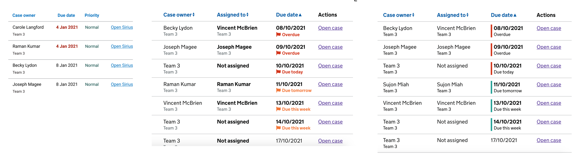
Contextual dates
Our Workflow Managers had told us they needed to see more context around the task due dates. On the spreadsheets these were colour coded
- White text on red background for overdue
- Red text for due today
- Amber text for due this week
To get this information across in an accessible way I tried different variations. The main issues using the same approach online were not using colour alone to indicate something, and the amber and red being very close to each other could be a potential issue for people with some visual impairments.
I settled on the third option which highlights the urgent date with a coloured line and states clearly underneath what the detail of the urgency is.
Round 3 of usability testing research
Some things we wanted to validate with the HTML prototype
- Is it clear how you would find a specific task in the filter list?
- Is it clear how you would view all unassigned tasks?
- Is it clear how you would assigned an unassigned task to a case worker?
- Are the deadlines of the tasks clear?
- Have we got the assigned to Team / Case worker concept right?
Accessibility testing
Once in production I worked with the Test Analyst to undertake some accessibility checks on the product. The accessibility knowledge in the team is quite low so I have initiated an accessibility strategy to build these checks into our workflow and to increase accessibility maturity of the team.
I created an accessibility checklist to work through which is aligned more closely with software development than public facing services, and we implemented a scheme where I pair with a developer to do Accessibility checks for each task, working through the checklist, and once they are comfortable they can pair with other developers.
Outcome
The result of this design and iteration is a tool which standardises the process for Workflow Managers, and will reduce the time they spend exporting data, creating reports and snapshots and allocating work. It allows them to see their teams workload at a glance, removing the need for some reports, and to allocate or reassign tasks from the same interface making their job easier and freeing their time up for their other responsibilities.
Feedback
I like that a lot...it gives more control over what people see and when they need to be concentrating on certain pieces of work
This is so straightforward. It’s going to save me a massive amount of time running reports and then breaking them down into 8 or 9 separate reports
That’s exactly what I’d need to see to give me an idea of where my team is at. “Just enough information...I think it looks really good”